11.28.2008
A new home for iro*iro
In the process of building a portfolio site, iro iro has migrated to Wordpress. Please bookmark: http://iroiroblog.wordpress.com
10.28.2008
The Four Lessons of Lou Dorfsman
From Design Observer:

When I learned the sad news last week that Dorfsman had died at the age of 90, I pulled a book down from my shelf that I've referred through now and then through the years: Dorfsman & CBS: A 40-Year Commitment to Excellence in Advertising and Design. Flipping through its 216 pages, I was struck once more by the range and timelessness of the work illustrated inside. And I found an interesting passage, where authors Marian Muller and Dick Hess describe "the do-it-yourself education of Lou Dorfsman," which began shortly after he joined the company as advertising assistant to the legendary Bill Golden, creator of the CBS Eye logo.
The Four Lessons of Lou Dorfsman
Lou Dorfsman and his “Gastrotypographicalassemblage” in the CBS cafeteria, 1966
![]()
Working as an in-house designer for a big corporation doesn't sound glamorous, and staying in the same place for more than 40 years doesn't sound like a path to career success. But Lou Dorfsman, who joined the Columbia Broadcasting System in 1946 and rose to become its vice president and creative director for advertising and design until his retirement in 1991, may have had the best job in the American design industry. Over the course of his career, Dorfsman was responsible for everything at CBS from its advertising to the paper cups in its cafeteria. Every bit of it was executed with intelligence, verve, glamour and taste. Trying to get good work done from inside a giant institution is supposed to be hard. How did Lou Dorfsman make it look so easy?
When I learned the sad news last week that Dorfsman had died at the age of 90, I pulled a book down from my shelf that I've referred through now and then through the years: Dorfsman & CBS: A 40-Year Commitment to Excellence in Advertising and Design. Flipping through its 216 pages, I was struck once more by the range and timelessness of the work illustrated inside. And I found an interesting passage, where authors Marian Muller and Dick Hess describe "the do-it-yourself education of Lou Dorfsman," which began shortly after he joined the company as advertising assistant to the legendary Bill Golden, creator of the CBS Eye logo.
It turned out after all that, while working as Golden's assistant, Lou had learned an extremely important lesson about the origin of ads. He had observed that while he and Golden were sitting in their shirtsleeves scaling photos and cutting type apart, certain ivy-leaguers in three-piece suits were sitting upstairs in conferences making decisions about the very projects he and Golden were producing. It was obvious to Lou that he could do a more intelligent and meaningful job if he were "up there" where the problems were being discussed.
So this is how he did it. Here are the four lessons of Lou Dorfsman.
Lesson 1: Mind the client's business.
Dorfsman began his career at CBS at the age of 28, working side-by-side with Bill Golden, his hero and mentor. After a few years, with the rise of the new medium of television, the corporation divided itself into separate units, the CBS Television Network and the CBS Radio Network. Golden took charge of advertising and design for television, the up-and-coming, exciting part. Dorfsman was made art director of the radio unit, the company's "orphan child."
Dorfsman ignored the gloom and doom surrounding the seemingly-fading medium of radio and threw himself into meetings with the radio division's sales reps, understanding its wide range of audiences, not just the listening public, but advertisers, affiliates, government agencies. Dorfsman produced hundreds and hundreds of unglamorous small space print ads. Almost every one is an ingenious gem. Many feature beautiful illustrations, including a 1952 ad that marked Andy Warhol's first commercial appearance in print. All of them unflinchingly and entertainingly make the case for CBS Radio. When Golden died unexpectedly at the age of 48 in 1952, Dorfsman was promoted to creative director of CBS television. Five years later, he was named head design director of the entire Columbia Broadcasting System.
Lesson 2: Learn to identify opportunities.
Through his career at CBS, Dorfsman never sat around passively waiting for requests from his internal clients. Instead, he pushed them, inventing projects that he thought needed to be done. Taking pictures at National Football League games in New York to promote CBS's local sports coverage, it occurred to him that there was a bigger story: documenting the technological feat of broadcasting multiple games each Sunday all over the country. The result was "Field of Vision," a 12 by 12 inch, 132 page book that reproduced, in gorgeous black-and-white rotogravure, photographs of each of the seven football games televised across the United States on the afternoon of November 4, 1962. The book emphasized the prowess of CBS's sports division, made a much-sought-after gift for football fans, and was credited with helping to secure the network's exclusive contract to cover NFL games the following year.
A few years later, Dorfsman topped that feat with a hardcover book commemorating CBS's coverage of the 1969 moon landing. 168 pages long, "10:56:20 PM, 7/20/69" featured a spectacular blind-embossed-with-moon-craters dustjacket and a subtitle ("The historic conquest of the moon as reported to the American people by CBS News over the CBS Television Network") that made clear Dorfsman's goal: to associate CBS inextricably with the grand events that defined the nation. Today, both books are collectors' items; neither would exist at all except for Lou Dorfsman's initiative.
Lesson 3: Assume responsibility.
You can tell that Dorfsman identified passionately with his employer's success. He valorized every one of CBS's shows as if they were separate clients, each with individual importance. It's fascinating: to my eyes, each ad appears to have been done from scratch, with its own unique look and feel; the only consistent element is excellence.
Dorfsman didn't hesitate to be an advocate for programs he cared about. He is credited with saving "The Waltons," a well-reviewed but low-rated show in the early 70s, by conceiving a single ad with the headline "This program is so beautiful it has to die" that exhorted viewers to support it. It ran once in three newspapers. Quoting Dorfsman & CBS: "According to Lou, the ad changed his life. He was never really certain how to measure the effectiveness of advertising. Now he had concrete results. CBS was inundated with letters and petitions bearing thousands of signatures. 'The Waltons' remained on the air and by the end of the season was the number-one CBS show."
Dorfsman, who began his career as an exhibit designer for the 1939 New York World's Fair, never limited his ambitions to print and broadcast. He designed the CBS news booths at presidential nominating conventions starting in 1964, and created some of the first modern "news sets" for daily broadcasts the following year. Dorfsman didn't worry about his job description. He just did what needed to be done.
Lesson 4: Define the company's character.
In 1965, CBS moved into a new headquarters building on Sixth Avenue, a black granite skyscraper designed by Eero Saarinen. Quickly nicknamed "Black Rock," the tower was conceived as a defining symbol for the company by its leaders — and Dorfsman's main patrons — CBS chairman William Paley and president Frank Stanton. Dorfsman understood that this new home was an opportunity to emphasize the company's commitment to excellence. So he contributed to the design of every detail, from the barricades that surrounded the site while the structure was under construction, to the art on the walls in the hallways, to the signage in the lobbies, to the freshly printed letterheads and business cards that greeted the CBS staff the day they moved in.
In contrast to the eclectic approach Dorfsman took to the design of the network's outward-facing advertising and promotional material, the graphic standards at headquarters were almost obsessively rigorous. Dorfsman commissioned two new fonts from Freeman Craw, CBS Didot and CBS Sans, and these were deployed everywhere throughout the building, including door numbers, elevator buttons, and wall clocks, 80 of which had to be dismantled and reassembled with new faces installed. Dorfsman's typographic eclecticism reemerged in his career tour de force, his solution for a 40-foot-long blank wall in the corporate cafeteria. There he collaborated with his longtime friend Herb Lubalin to create an all-type, three-dimensional collage combining words related to food and culinary paraphernalia into a relief sculpture that was dubbed the "Gastrotypographicalassemblage." A combination of enthusiastic excess and clinical precision, the wall was hailed as Dorfsman's ultimate achievement. But I must confess, I am just as impressed — if not more — by the fact that he convinced the NYC safety authorities to allow him to use the elegant (and definitely non-code compliant) CBS Didot font for the building's fire exit signs.
There is no one today — anywhere — that can match the breadth and depth of design authority Lou Dorfsman exercised in his years at CBS. Certainly there is no one like him there today. He retired from the company in 1991. The building was renovated shortly thereafter and new tenants moved in to join CBS. The Gastrotypographicalassemblage was dismantled and put into storage, where it has been slowly decaying. The good news: there is a movement afoot to restore it led by the ambitious team at the The Center for Design Study, who are actively seeking financial support.
A few years ago, we had an appointment at a midtown address that was new to me, 51 West 52nd Street. When the taxi pulled up, I said to my colleagues, "Hey, this is the CBS Building!" And it was. I had never been inside. We were there to see one of the new tenants, not CBS. But the bronze signs in the elevator lobby were still set in CBS Didot. They looked worn but they were as beautiful as ever, forty years later. Rest in peace, Lou Dorfsman. You will be missed.
10.13.2008
60th Anniversary of the UDHR
From the Human Rights Action Center, a beautifully crafted animation of the Universal Declaration of Human Rights adopted 60 years ago this December by the U.N. While it has its limitations in western-centric views, a statement like this was revolutionary for its time.
10.05.2008
iD x advertising x branding
From Core77, an interesting read on the increasingly interlinked relationships between advertising, branding and industrial design. Having been in advertising with mixed feelings, it is a reminder that everything happens for a reason. Check out the article here.
Mentioned in the article, Nixon watches. They've been coming out with some really nice styles lately...might be time to reconsider a buy.

10.03.2008
Rain on the brain.


9.30.2008
Strike a Pose
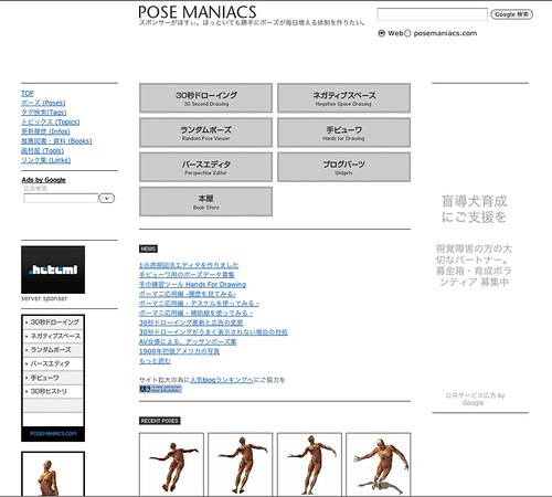
Image courtesy: POSE MANIACS
Bookmarking this site for later this term when we get to figure drawing. Kind of excited, kind of scary! Cars and people are probably the two most intimidating things to draw for me and for that reason I've yet to attempt it. Drawing from life is the more challenging but these computer generated poses are a good way to get some extra practice. The site is in Japanese but it's translated fairly well that even I can navigate it. Check it out here.
9.25.2008
CAS SF

Image Courtesy: Inhabit
More info at:
Inhabit: 'The New Green California Academy of Sciences Unveiled!'
9.22.2008
The art of business in art
A short article from Unbeige on BusinessWeek editor, Bruce Nussbaum's appointment as a visiting professor of Innovation and Design at Parsons sparked some thoughts on my time in July.
The wonderful thing about Parsons is they emphasize this truth in the program and as a result graduate well-rounded, business savvy individuals. They encourage students to develop a style and explore any direction without fear of being ridiculed. Take it as far and away from reality as you want; then reel it back in if necessary. In addition, there is a strong emphasis on aesthetics in every step of the process. I benefited from their requirements to study art and design movements and be inspired to re-imagine them in new ways. I had not studied art history since high school and definitely needed the refresher. Then of course, the aesthetics of your creations is imperative. But it doesn't stop there. Presentations were scrutinized to the point of feeling like a cross between a graphic design course and a Toastmasters meeting. Their full time programs integrate business courses and draws upon resources like Columbia's b-school for collaborations such as the Corporate Design Foundation. So it's not just about making beautiful creations, it's getting them out there to succeed and allow the designer to continue and grow in the industry.
Does the art in design die a little with commercialization? Yes. But this sacrifice brings design to further reaches and hopefully instills a love of the arts to those who may not have been exposed otherwise.
9.19.2008
Is faking it better?

8.31.2008
Fluid attraction

Image courtesy: geekologie.com

Image courtesy: MAKE
6.30.2008
Parashell Umbrellas

From PingMag, John Di Cesare discusses his Parashell umbrellas - inspired by seashells, brought to life from abandoned umbrellas. Also, tidbits on Japan's umbrella culture. Read more here.
I'll be on hiatus for the next month in New York studying product design at Parsons. I hope to return even more inspired, captivated, and enamored by industrial design; resolved and motivated to continue my studies.
2.27.2008
The Art of Sound

Clipboarding this article; I think it'd be neat to do something similar with a Marimekko print. From the dwell blog:
Sound bounces off hard surfaces, such as wood, metal and tile, creating a din. Upholstery, canvases, pillows and acoustic tiles absorb sound, helping you to better hear its nuances. Herman Miller makes acoustic panels (above) in modern prints for sleek environments, and MyTheater offers solid colors in larger sizes that can do double duty as artwork.
1.18.2008
WWF Deeper Luxury Report
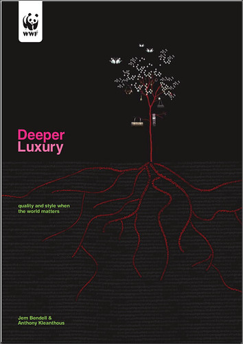
The World Wildlife Fund has released a report on luxury brands and their responsibility to improve sustainability. Regardless of status, companies that are proactive about creating environmentally and socially responsible design make a powerful statement on the importance of being earth friendly. Check out the report here.
Subscribe to:
Posts (Atom)
